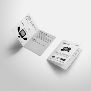
1. Follow similar merger principles
Facing a design task, first of all, through the classification and induction of information, the level of information is summarized. Such as title, subtitle, subtitle, quotation or explanatory text, text, etc. Then, the image information related to the text is also classified in detail, so that the text and the image are one-to-one correspondence, forming a clear information level. In this way, we can consciously combine the same level of information in the same area to form a unified design style.
2. Determine the content of the center
Because the brochure needs to convey effective information, the central content of the layout needs to be determined in the layout. The central content can be determined according to company attributes, product attributes, market, consumer needs, etc. The most important thing is to have a central content that can attract attention. Therefore, in the design process, you need to pay attention to the comparison of different content. Each information layer can determine a central content and select different central content in a targeted manner to establish a creative layout.
3. Follow the principle of proximity
In the design of the brochure, the principle of proximity is to make the elements of the same information level as close as possible. The tighter the layout elements, the stronger the overall layout. On the contrary, the arrangement elements of different information levels should be separated as much as possible to avoid information confusion and ambiguity. Clear information division can make information transmission clearer and orderly. If the distance and position of the information layer in the partition are too random, the information transmission will not be smooth.


