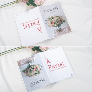
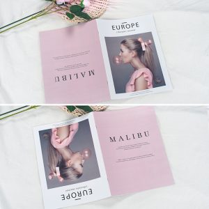
Color is closely related to people’s lives. Every day we are exposed to a variety of colors. Color also plays a great role in design. Although some people will say that color does not play a decisive role in design works, many times we Just use black and white to show the design effect, and sometimes it is more shocking and appealing than the use of color, but color still has its irreplaceable advantages. It can enrich the content of the work. Let our vision become colorful and energetic, and not too monotonous, in addition, the color also increases the persuasiveness of the design work and so on. Therefore, in magazine printing, the use of color in magazine design is also indispensable.
So, how do you match and use colors when printing magazines when designing magazines? When designing magazine printing, the design of the cover should first be considered, because whether the cover is attractive to a large extent determines whether consumers have a good impression of the magazine, arouse their interest, and whether it can further generate a desire to buy. Therefore, when designing the cover of magazine printing, you should choose a color that has great visual impact and can make a deep impression. For example, red. Red is brighter and more conspicuous, making it easier to find and remember. After choosing the main color, it is necessary to choose the color associated with it for reasonable matching, so as to give people a good and comfortable visual experience, and then generate interest for consumption and purchase.
In addition, when choosing colors for magazine printing, it is necessary to pay attention to the use of warm and cold colors. We usually think that warm colors generally give people a feeling of warmth and comfort, while cool colors generally give people a feeling of cold. In fact, it is not necessarily. With the changes in the brightness, hue and purity of the cold and warm colors, the style effect of the design will be Not the same, the feelings given to people will change accordingly. Therefore, we cannot completely define warm tones as warm, and cold tones as cold and dark. With the changes in brightness and purity, the roles of the two will also be interchanged. Therefore, magazine printing designers should use the various factors of color transformation in a reasonable combination of colors and colors to make the design of the work harmonious and vivid.
Of course, the color matching and use in magazine printing involves far more than these things. This requires designers to continue design research and experience summaries to design better works.


