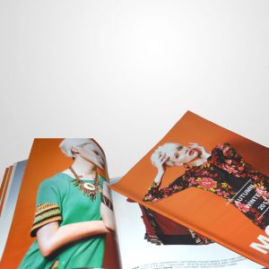
One: The pictures should be kept high-definition, and do not stretch or zoom at will to avoid blurring in printing.
Two: The font size of the magazine layout design is generally not more than 9 points.
Three: Pay attention to the coordination of English fonts and Chinese fonts when typesetting, so as to avoid excessively large intervals.
Four: For works designed with software such as CoreIDRAW, the text must be curved or drawn to prevent missing fonts.


