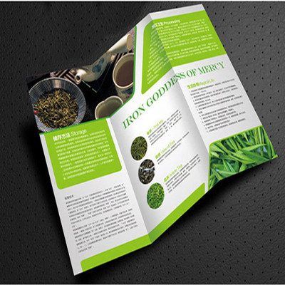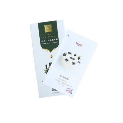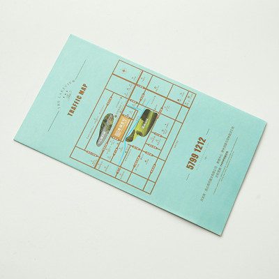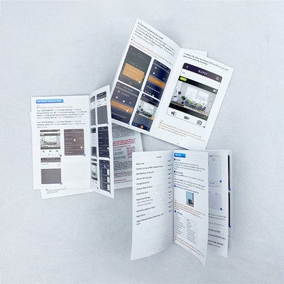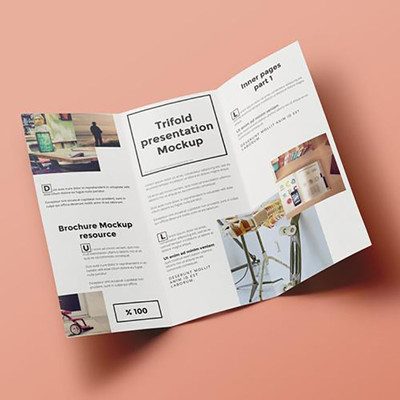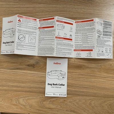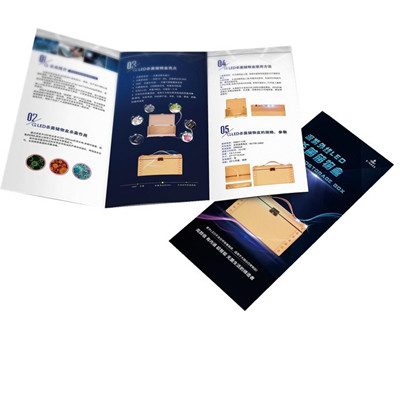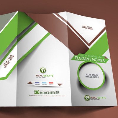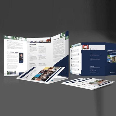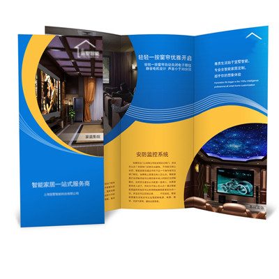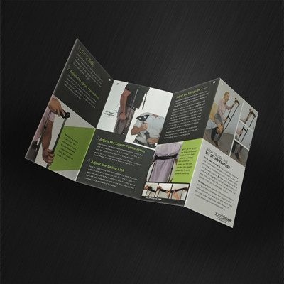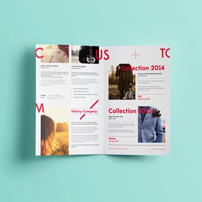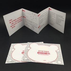
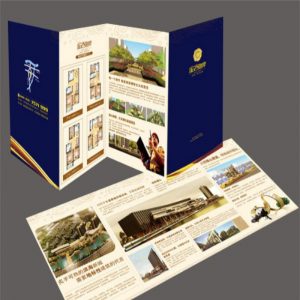
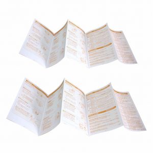
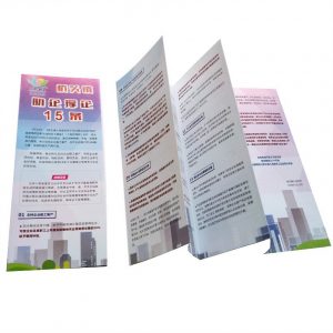
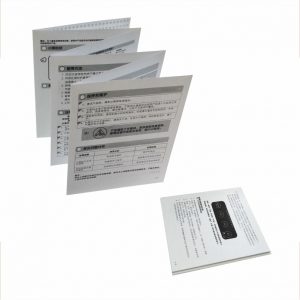
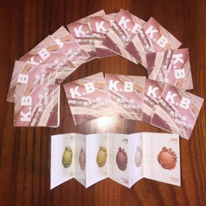
| product type | Bochure |
| Product Material: | copper sheet |
| Paper Type | Art Paper, Cardboard, Coated Paper, Corrugated Board, Duplex Board, Fancy Paper, Kraft Paper, Newsprint Paper, Offset paper |
| Surface Finish | Film Lamination |
| Printing Type | Offset printing |
| Printing | Offest Printing |
| Size | Custom Size |
| Color | Customized Color |
| Item | Customized Production |
| Logo | Accept Customized Logo |
| Feature | High-definition printing, clear and beautiful, environmentally friendly ink |
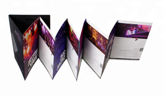
| Binding | Perfect binding / Glue binding, Saddle stitch, Burst perfect binding / sewing glue binding, Lie flat perfect, Case bound / hard cover binding, Wire-O binding, Sewn |
| Lead Time | 5 working days or more, depending on the quantity. |
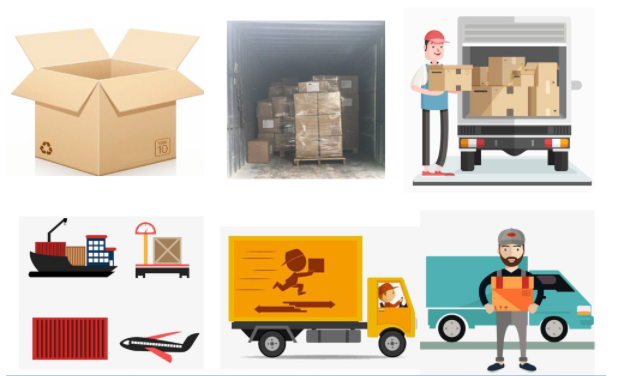
| Packing | 500pcs/box , 2000pcs/ctn or according to customer demand |
| MOQ | Offset printing: 300pcs |
| Payment Terms | T/T in advance, PayPal, or West Union |
How to make brochure design better
1. Understand printing specifications
Unlike design that relies on digital media, such as website design, you need to know exactly what your budget is and what you are allowed to print. This may affect the quantity, size, paper inventory and effectiveness.
Our suggestion is to set the manual specifications that belong to this project at the very beginning, and you must know what you need and what you will create at the very beginning.
Consider such things as the size of the paper, wrinkles, and bleeding. Before delving into the design process, it is very important to understand the performance of the printer. For thicker, smaller-style brochures, you may also need to consider the layout of the pages.
2. Seriously consider the needs of users
The form and distribution of the brochure design should reflect the wishes of the audience. Even the design that looks like a traditional paper brochure can be digitally converted through the interactive function of the PDF format.
If you need to distribute brochures to your audience, consider a size and format that fits in a pocket or bag easily.
Finally, for stakeholders or key partners, thicker or tougher, multi-page or larger sizes may be more appropriate.
The last factor to consider is the audience-consider the age of the audience. Are they young or old? This will affect the size and overall feel of the design.
3. Use high-quality elements
You cannot use low-quality elements when producing prints. Low-resolution photos or illustrations can easily affect and destroy the overall vision.
So, everything you use needs to be high-quality and high-definition to ensure that your brochure design looks great. Including pictures, illustrations, icons, logos, fonts and a clear color palette.
Although depending on the project, you cannot achieve precise specifications and uniform printing methods, generally the images and design elements you want need to be at least 300DPI in size.
4. Consider the way of display
Where will users see or pick up your brochure?
Create a graphic design that can still work in this environment.
One of the most common problems with brochure design is to forget that most brochure design needs can be applied to multiple display methods.
Ensure that the key vision and information can be easily seen and read when extracted from the presentation medium.
Another key consideration is scale and size. How big does the brochure need to be? What is the most suitable distance to attract users’ attention to the maximum? Design elements should be scaled proportionally.
